Exploring Company Footprints

Enigma has a massive repository of unique U.S. company data. For our internal Hack Week this year, our team decided to explore a new dimension of the data we hold—that is, its temporal dimension.
At Enigma, we have focused on identifying, validating, and presenting data about a company, and then showcasing it as a single cumulative snapshot. By focusing more heavily on the relative timestamps of company events, such as the year in which a company acquired an operating licence, passed an inspection, or received funding, a clearer story of the company and the expectations we have of it emerges. One of the most telling measures of company’s future success and profitability is the company’s evolution in size, measured in headcount.
Our team was excited to spend Hack Week representing company data over time. We also wanted to create a visualization of changes, knowing that a timelapse would be an interesting and effective way for a viewer to understand Company Footprints.
The scope
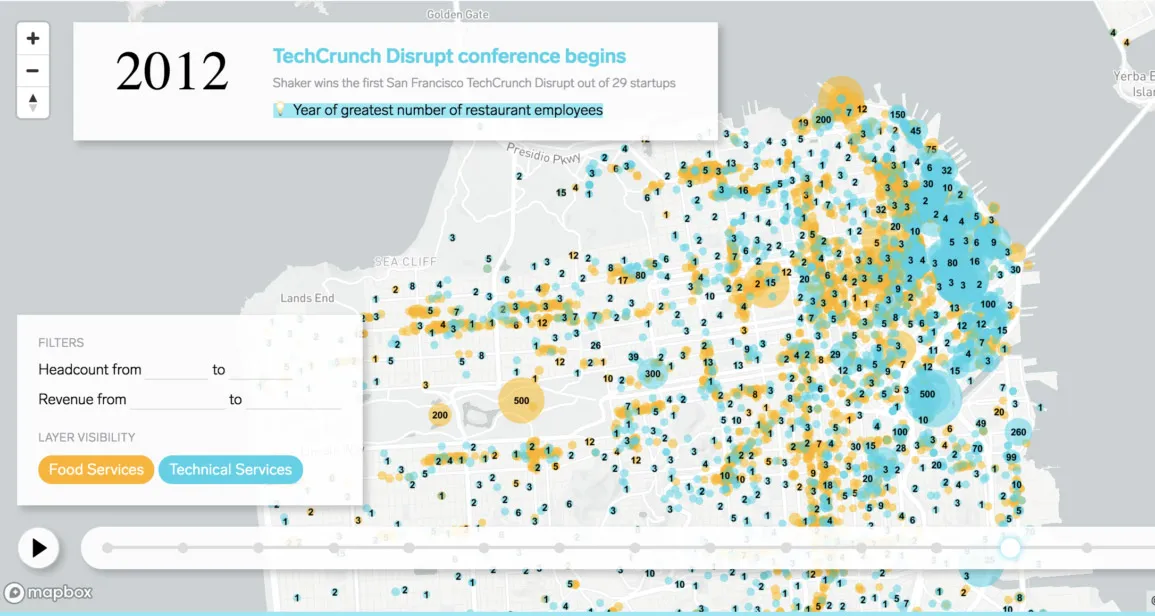
To narrow the scope of our project, we decided to focus on companies in the San Francisco Bay Area since 2001.
We did this for a few reasons. First, we knew we had extensive annual demographic data on companies in this area and were confident that with some work, we would be able to capture their story in depth. Second, we were interested in what we’d find in this region, knowing the Bay Area to be a highly populated, educated, and wealthy part of the United States—how have Bay Area companies formed and changed?
Finally, we decided to showcase companies in the technology and restaurant industries, specifically. By narrowing down to two industries, we would be able to plot the companies on a San Francisco Bay Area map.
The back-end tech
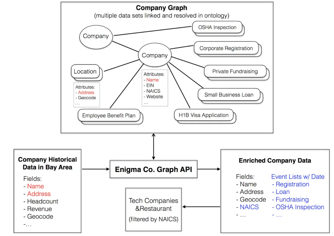
We used two distinct data sources to capture Company Footprints. One contained yearly snapshots of company properties at a different points in time, e.g., “headcount” or “revenue” from 2001 - 2017. The other was our company graph, which contains information from multiple public datasets. References to individual companies have been resolved into a single company entity, with event-based attributes connected to those companies merged accordingly.
Our first step was to link the companies in the annual temporal growth data source to the companies in our company graph. We mapped each of the company name and location pairs to their entity id in company graph, and queried the graph for the relevant events. We then parsed out all of the annual headcount, annual revenue, and events from both data sources, combined them and aggregated by company, location and year.
Incorporating historic context
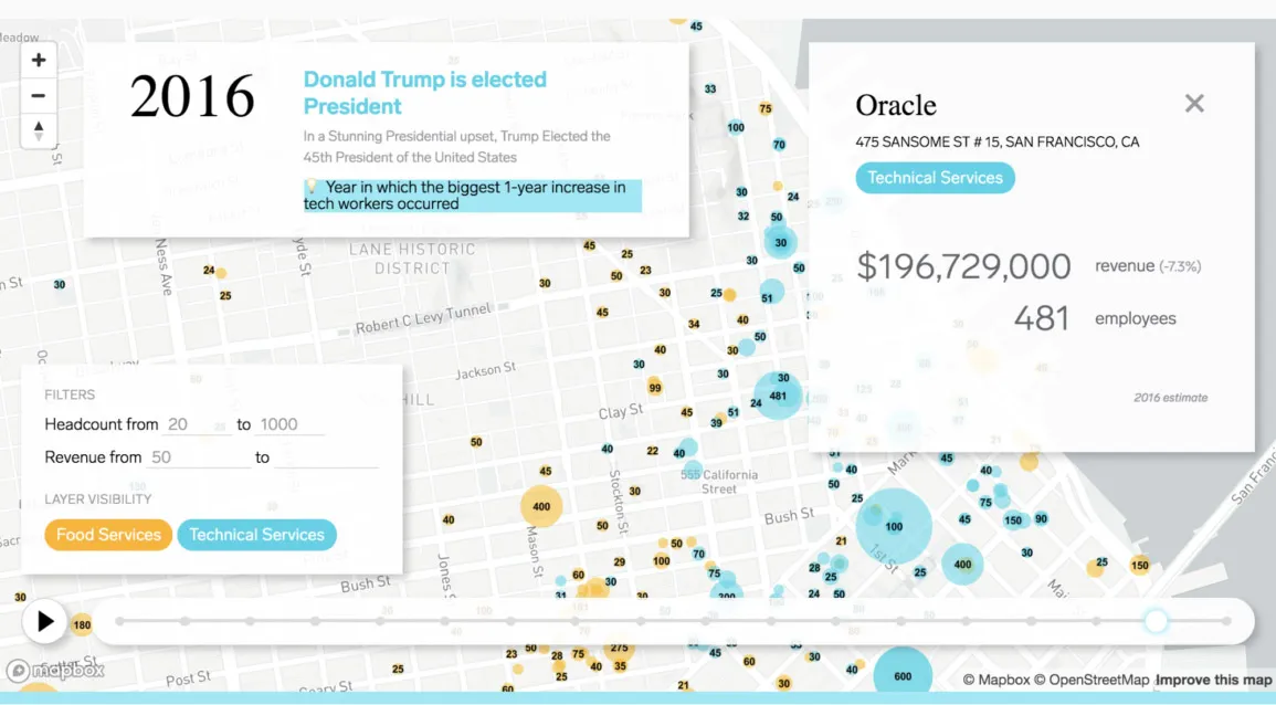
Because we were focused on temporal changes of companies, we thought that further contextualizing them in macro, socio-political events would further emphasize evolution as the theme of the project. We researched key socio-political events—both specific to the Bay Area as well as the U.S. overall—and included the ones we found to be most relevant in the timelapse alongside company headcount changes.
Events we show range from changes in Health and Safety regulations to Presidential elections, to headline-making IPOs. We’re not suggesting these events directly caused any company births, changes or deaths, but we wanted to offer some interesting reminders to viewers of our project to the changes in the outside world.

The front-end tech
The front-end itself is a simple JavaScript application that leverages just two libraries (Mapbox GL JS and Lodash), and the static portions of the front-end were created with HTML and CSS.
Mapbox takes care of the interactive map, and provides the impetus for updating the custom HTML map overlays whenever the map instance fires an event (e.g. click, drag, zoom). Upon page load, two map layers are created for markers and marker labels, respectively. These layers are reused throughout the animation. As the animation plays, new data in the form of static GeoJSON files is loaded into each layer.
The design
To craft an expressive user experience, we highlighted the two distinct industries using a visual design based on blending colors. When viewed together, the map layers for each industry emphasize the interrelatedness of these businesses over the last two decades.
We included a playable timeline, which allows the user to watch the changes unfold on the map, with data displayed on a yearly basis. We also developed a simple interface for filtering businesses by headcount and revenue to give users more control over the information (which is pretty dense). This offers a way to further declutter the map beyond just turning the map layers on and off.
Conclusion
Hack Week is short, and teams are always left with a million ideas on how they might, with more time, continue building their projects. Company Footprints is no exception.
We have plans to add more analysis to spot trends based on external historic context, as well as compare company footprints within industries, or segments like neighborhoods. We’re excited by the possibilities of a tool like this, and what else we might be able to uncover.
Dig Company Footprints and want to work with a data-driven team? Join us—we’re hiring.